My festive mood started before Halloween this year, which is weird for me because Halloween has always been my favorite. I usually go all out with the spooky decor in my front yard and the well-planned costumes. But this year I was ready for that cozy, glittery, festive time in which I could eat comfort foods, decorate cookies, and snooze by the blazing fireplace. Needless to say, when the jack-o-lanterns came down I was setting up my Christmas village and buying fire logs.
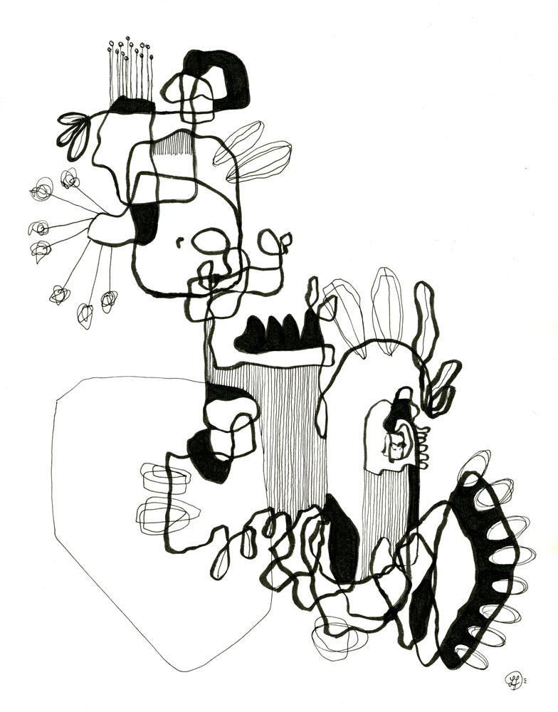
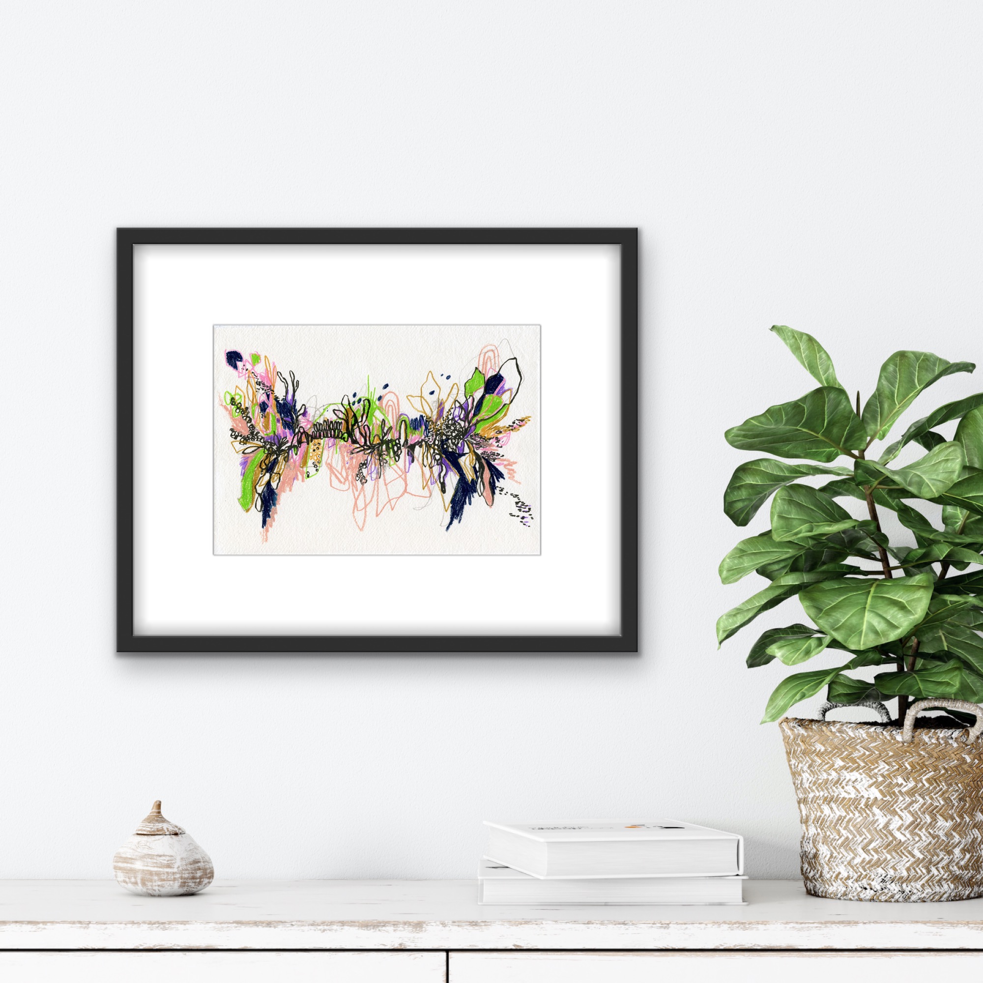
My solo show, which I’ve been calling “Hidden Feelings” has officially been hung at Central Bank of Boone County in Columbia, Missouri USA. If you live around the area, or happen to be passing through, I’d love it if you stopped by to check it out.
For those of you who are not in the area, and for those of you who would like a deeper understanding of the works hanging on the wall, I’ve put together this list of each piece and what inspired its creation.
This is PART TWO of that list. I highly encourage you to check out PART ONE so that you can learn more about the exhibit and its meaning, as well as the first ten pieces you will see as you walk through the show.
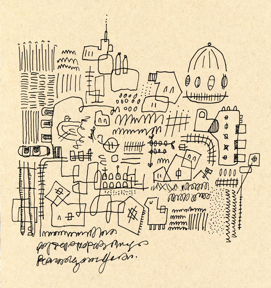
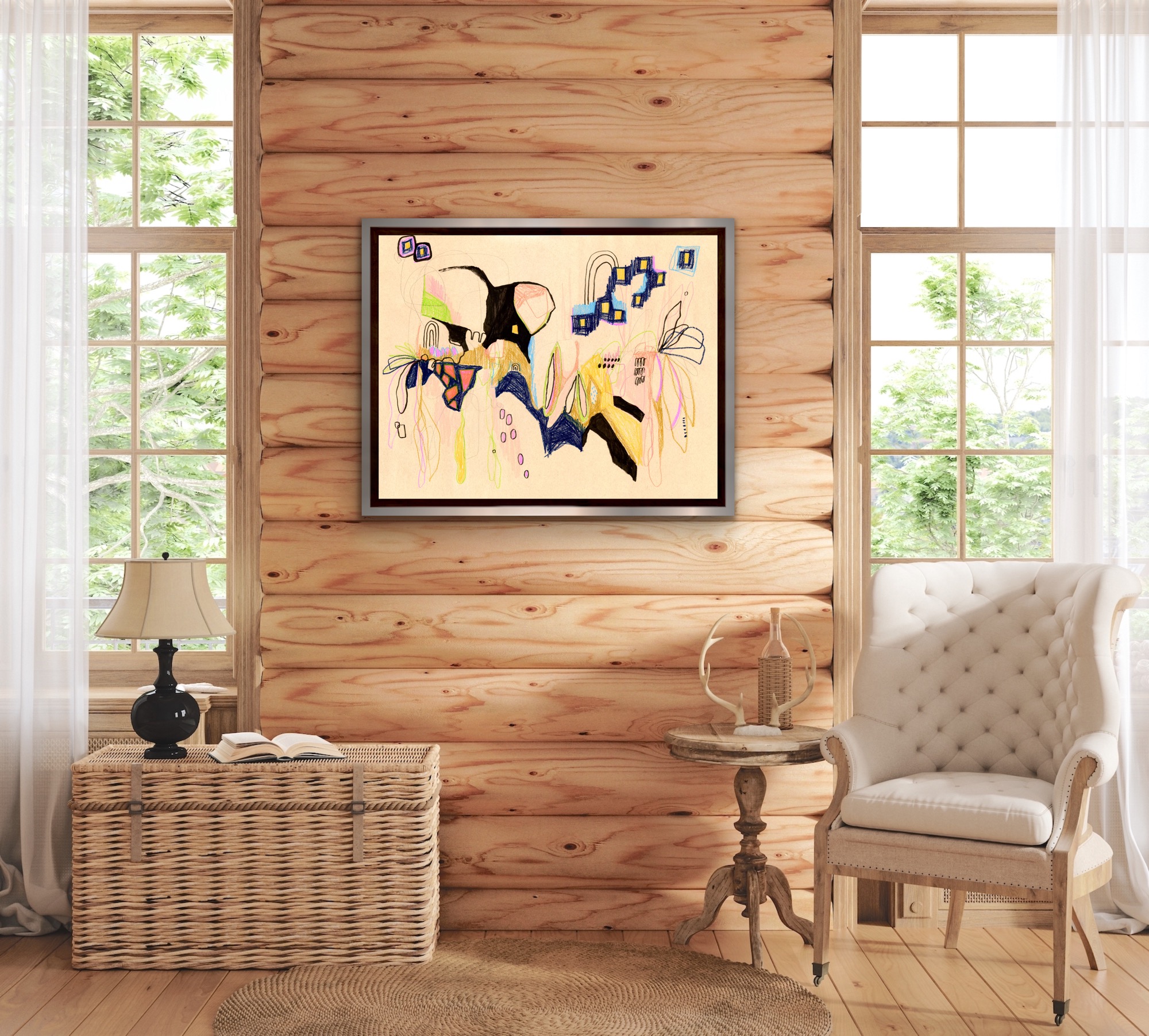
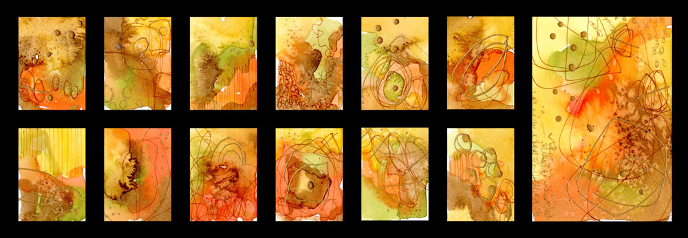
My solo show, which I’ve been calling “Hidden Feelings” has officially been hung at Central Bank of Boone County in Columbia, Missouri USA. If you live around the area, or happen to be passing through, I’d love it if you stopped by to check it out.
For those of you who are not in the area, and for those of you who would like a deeper understanding of the works hanging on the wall, I’ve put together this list of each piece and what inspired its creation.
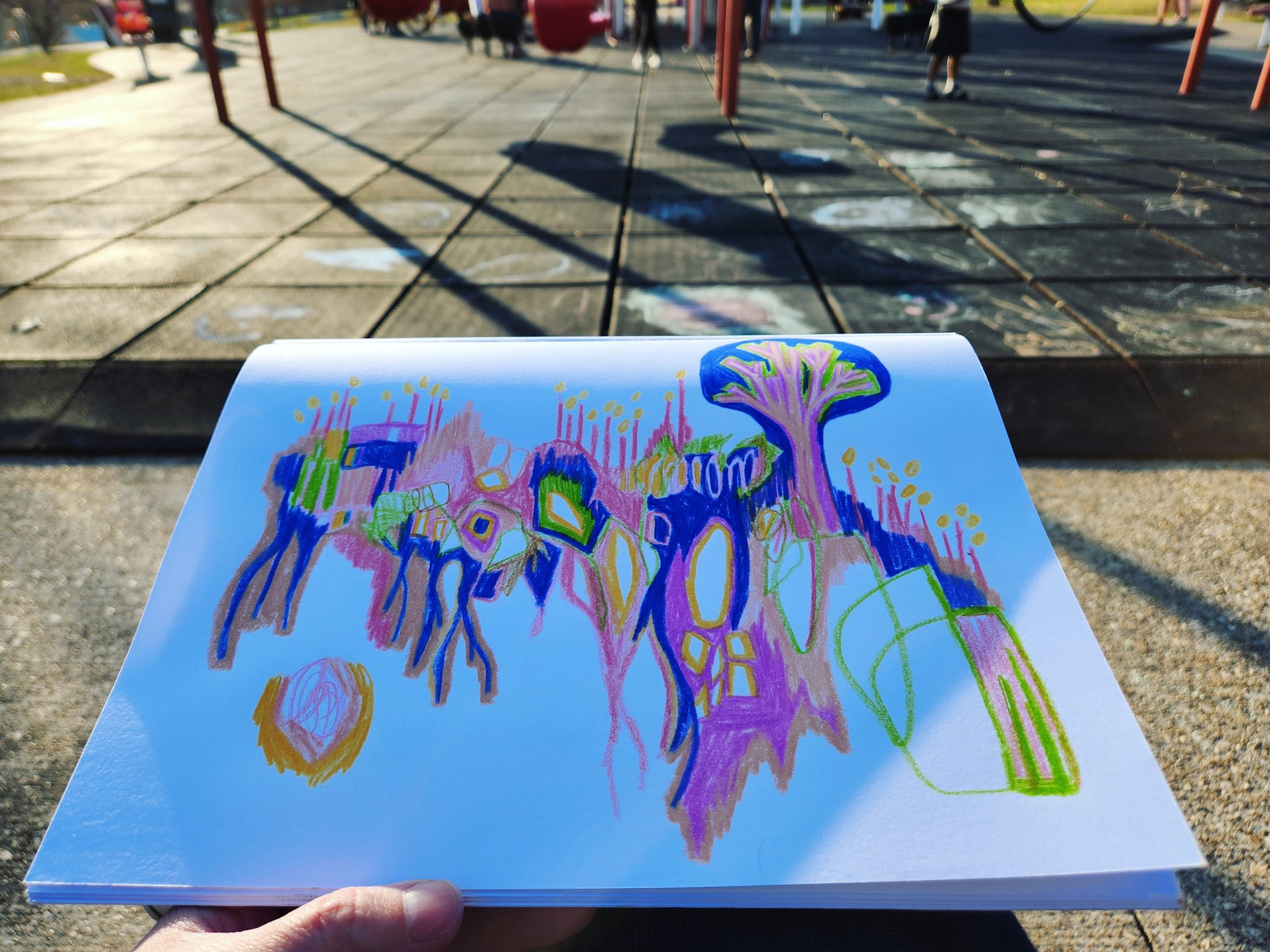
Springtime as a kid was always one of the most exciting times for me. I can still taste the crisp air, can hear the robins singing their morning song. I remember always climbing the mulberry trees to check whether they had berries yet, remember plummeting down my aunt’s steep driveway on a big wheel, my only way of stopping being a nose-dive into a shallow trench. And the best days were the windy days, when you could practically chew on all the smells as I slipped in between the billowing bedsheets my mom had hung on the clothesline to dry.
Spring meant something to me then, and those vibes never changed.
So, when it began to feel like spring again a few weeks ago, I cleaned the house and opened the windows, bought candles that smelled of peach instead of pine, and I took Goo to the park almost every day, where I would feel the sun on my face and let the southern wind wake me up from hibernation.
That’s when the playground scribbles began, which were a combination of alcohol markers, colored pencils, watercolors, and charcoal. Allowing myself the freedom of as many tools and colors as I wanted brought back that childhood mentality when merely holding a fat crayon was a feat comparable to the Mona Lisa. Combining this medium freedom, the artistic naivety and the springlike weather, I came up with the Springtime Vibes collection.
These works are about the infant spring, when the trees are barely budding and the nests are still quiet and the seedlings only just begin to sprout. This is a delicate time for nature, in my opinion. It’s a transition period. Trees go from living death to living in a matter of weeks. The grass goes green. Tulips, daffodils, and Irises bloom. The whole process must take an exuberant amount of energy. An energy I worked to portray in my vigorous scribbling and bright colors, while also keeping the quiet, infant moments intact with light pencil marks.
The new series has eight pieces in all ranging in size from 5×7 inches to 19×24 inches. Each are works on different types of paper and were made with a variety of tools from alcohol markers to colored pencils.
I have been in full experiment mode lately. What this means is I have been trying a ton of new things, filling sketchbooks with “let me see what this does” adventures, and scribbling without an end game. It sounds fun, but this isn’t always welcomed by my conscious thoughts. Mostly because when I’m experimenting my work is all over the place, and I start asking myself a ton of questions like…
What kind of artist am I?
Is this the kind of artist I want to be?
Would this even hang in a gallery?
Is my style shifting?
Do I even have a style?
Can I call myself a professional? Or am I just a hobbyist splashing around? A hobbyist who needs to get a real job..
The year started quietly for me, like the morning after a good snowfall. Muffled. Dormant. I was a hibernating bear.
Needless to say it took a few days to get back into the groove of creating. My goal was simple for the month: form a gouache habit so that I could start—and successfully complete—a 100 days project.
That project starts January 30th.
But the new year, as I’ve said before, isn’t a cure-all. Looking behind me, beyond that dividing line between 2022 and 2023, my art had been lacking in something, and still was. I felt free in scribbling, as usual, but there was just something…hollow about it all. Maybe I’d just fallen into a routine of “sameness” and my work had become less about expression and more about muscle memory.
However, after the process of forming this daily gouache habit began, I came to my first conclusion: my world didn’t have enough color.
In the past I’ve always kept my tones a bit desaturated so that they would appear more natural, organic, and sophisticated. Which is interesting to me because if I were to describe my personality it would be the exact opposite. Loud, vibrant, and playful. A bit much at times.
But just working with vibrant colors wasn’t enough. While my studies gave me a buzzy feeling, my larger works were still lacking in something, despite their newfound vibrancy. After a week or so of discovering new artists, creating vision boards, and self-exploration I came to my second conclusion: the loud colors were coming across, but the playful aspect was not.
So I turned a geometrical “almost perfect” painting into a wild scribble of personal reflection, inspire by the feeling I’d gotten after seeing the crescent moon at the blue hour of a recent morning. I called the initial, geometrical version “dishonest” on Twitter, and when asked why I thought it was dishonest, I responded:
…art is play, scribbly, and a dance. I shouldn’t edit over the dance.
In other words, painting the scribble and transforming it into this geometrical, neat and orderly piece was like telling a great lie. And not only was I lying to my audience, but I was lying to myself.
BeforeAfter
I am not clean, orderly, or neat. I am a big scribbly mess of energy and I tend to run eople away before I can make friends with them because I’m just a bit….much. When my art is also a bit…much…my covering it up is almost like trying to hide my identity.
Intuitive art is not about hiding your identity.
Art, in general, is not about hiding your identity.
So I went back to the very root of why I create art in the first place: it’s fun. I like smearing paint on a canvas while dancing to Aurora and Harry Styles, so that was a good start. Art went back to being more about the process and less about the final result.
But it’s not always rainbows and butterflies and play. While January has apparently been a good month so far, by the looks of my scribbles, my work is not always fueled by joy and playfulness. Sometimes I’m in a shit mood and can only think about mass shootings and the dying planet. In the past I’ve often kept those negatively-fueled pieces to myself. But that, again, is another lie. Life is up and down and turned around and upside down and nonsense. So keep an eye out for the grumpy art too.
Processed with VSCO with presetProcessed with VSCO with preset
My newest scribbles are making their way onto my shop as they’re finished. Click here if you’d like to take a look. If you have any questions you can email me lina@linaforrester.com
Until next time, may your scribbles be scribbly and your identity be un-masked.
The rain was unexpected. I woke at 7am to my husband returning home from work. We exchanged good mornings/nights and I went downstairs as he went to bed. Him working the overnight shift has been weird for us both, but it’s times like these when I’m glad (instead of guilty) that I have a mostly work-from-home job. Because if I didn’t, who would help Goo get to and from school? Or manage the household during the day while husband is asleep? These are the things I can do for our family, even if the art income wanes.
When I entered the dining room, I looked through the large paned doors that lead to the back deck and noticed how cloudy it was. It wasn’t supposed to be cloudy at all. Hot and sunny, in fact, but instead it looked like it was about to rain. And it did rain. When I poured my coffee I took another look outside and saw the first droplets on the wood of our deck.
With September only a few weeks away I can’t help but already be in “fall mode.” Especially with the fog and the cooling temperatures, and now this morning rainfall. I grabbed a sweater, lit a candle, and decided to make some tea-toned paper for later projects. For some reason, rainy days are the best days for tea-toning paper.
How to tea-tone paper:
Preheat oven to 200 degrees Fahrenheit
Brew a large pot of strong tea. I used about four cups of water with eight tea bags. The stronger the tea, the stronger the stain. This is also true with coffee-toned paper.
Pour the tea into a shallow dish or pan. I used our 9×13 glass baking dish. It’s a good size if I want to stain larger paper.
Immerse paper in tea and leave it in there, turning occasionally, for ten minutes (or more, depending on how stained you want them to be).
Remove paper from tea (letting it drain a bit to get off the excess tea) and then lay it on a baking sheet.
Bake for 5 to 10 minutes, flipping paper every couple of minutes until both sides are dry. Note: handmade paper sometimes takes a bit longer. Just keep turning paper every couple of minutes until it’s dry.
Goo joined me to tea-tone her own paper when the first batch was baking. I showed her how to immerse the paper and remove it carefully to be baked. Regular copy paper will be very fragile and could tear. This can be in your favor, however, if you want your paper to look old. I also showed her how you can crinkle the paper up after it’s been in the tea, before baking, to get a wrinkled effect.
I used some of the hot press sheets for abstract landscapes. For the ink I used the black Hydrus watercolor ink by Dr. Ph. Martin’s. I like this one because it has almost a purple/green granulating effect when you add salt. Combine this with the tan tone of the paper and the landscape resembles a split-toned photograph, something I’ve loved ever since discovering the photography of Irene Suchocki.
I also stained some small, leftover Arches cold press to make a tiny book of landscapes. For no reason other than it’s fun, and because tiny books of landscapes are adorable. I even stained a small sheet of Khadi for the cover.
The clouds held on until that Sunday afternoon, when it warmed up enough to take Goo to the pool. It was an interesting day, like living in two different seasons at the same time. Fall in the morning, summer in the afternoon. This is Missouri when the seasons are changing, and here by the river we get extra fog each morning to remind us that those longed-for chilly, crinkly-leaved, chimney-smoked days are just around the corner.
If you’d like to take a look at the landscapes in this tea-toned project, which I call “Prairie Winds,” you can head on over to my Etsy where they are currently available for purchase. They’re little paintings, meant to be looked at from a closer distance, and minimalist enough to be placed anywhere. I like to imagine them being placed by windows that are occasionally freckled with unexpected rain.
Last week is a blur for me. I caught my daughter’s head cold and it put me up on blocks for days, during which I lied pitifully on my death bed (the couch) and napped between spurts of art documentaries and Sims 4. My Covid test was negative, but with how delirious I was I wouldn’t be surprised if I botched it somehow.
And, while I’m out of the thick of it, I’m still not up to full speed, which is making it a bit hard for me to find the focus to do intuitive work. Which I find interesting, actually, because while I was on death’s door I was feverishly painting gouache landscapes.
But getting going intuitively seems to be trickier when I’m sick. This might mean that it takes more focus to work subconsciously. Or maybe it means working from a photo is more mechanical than it is emotional. Either way, my subconscious mind is a bit “sleepier” at the moment, giving my conscious mind full reign to remind me of things like “composition” and “color theory” and “the perceived importance of straight lines.”
So what does one do during a time like this? I suppose I could melt into the couch some more and live vicariously through my Sims.
Or I could blindfold myself.
Let’s take a look at what came forward when my hands were given full autonomy, shall we?
Prepping for this little blind session was pretty easy. I simply put a few different dry mediums into a box (dry pastels, oil pastels, charcoals, etc.) and kept their color scheme relatively “earthy.” Except for the one bright pink oil pastel, which I’d hoped I would grab at least once during one of these little scribblings. I got lucky twice!
After the first two pieces were finished, I noticed that I began to move my whole body instead of my arm. I experimented with using my non-dominant hand. I enjoyed the luxury of pure artistic freedom. Like I might have as a kid who had yet to learn what made art “good” or “bad.”
And that’s the whole point. These scribblings weren’t about drawing the most perfect image, or about getting the composition right. They were about getting into the very groove of play.
These drawings aren’t masterpieces. And they aren’t perfect. Like at all. But I think that’s what makes them so fascinating. Best of all, they tell the truth.
Until next time, may your scribblings be blind and your drawings be messy.
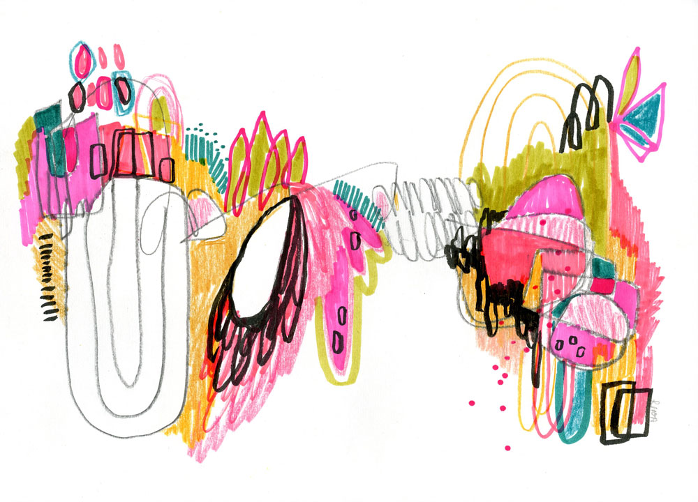
My spring collection, Road Maps, has officially launched! This is a project I started some time in February, when I worked on mindfulness through drawing with only one color: black. As I worked, I noticed how each of the pieces would resemble a map one might draw for someone else to help them reach a destination. This, in turn, gave the series its name.
What I love most about these works is how they are similar to one another, yet somehow so different, which seems to resemble our own journey as humans. We are all on different paths with different destinations and have come from many different pasts, but we are all on our own trek toward something. What are you trekking toward?
The tiny details in each piece also give the viewer pause, which shows him/her the importance of being present. We may be from somewhere and on our way to somewhere else, but the only thing that is certain is the right now. Who you are today is the most important you.
Each of these works was intuitively drawn, with the occasional conscious thought here and there to give it the attention it deserves. All of them tell a story for me, but that’s my own story. It’s the stories they tell you that give these works a funny kind of magic. What you see in one drawing may be the complete opposite of what another sees.
Finally, I noticed that I was merging both man-made objects with the natural world, which resonates quite deeply with my belief that we as humans are a part of nature, not a separate entity.
Those of you who follow my Instagram and Twitter know that I took a break over the weekend from the “business” side of things and instead traveled to St. Louis to visit the Van Gogh immersion exhibit. While there, we also visited the Gateway Arch and perused its underground museum. Getting out of the house and doing something brand new seemed to be just what I needed to get back into my creative flow. Before we even left for the two hour car ride, I was already scratching out landscapes with pastel pencils.
I continued these little landscapes off and on through the car ride to keep myself busy and also while waiting for our dinner. Goo even joined me in the sketching after we purchased her a sketchbook from the Van Gogh exhibit.
And speaking of the Van Gogh exhibit, could there be a cooler thing to experience? The whole first part of the exhibit was quotes from his letters to Theo and tidbits of history. The second part was a 35 minute long immersion experience, during which you could walk around or sit as Van Gogh’s work is projected all around you. Sometimes the paintings would move, portraits would blink, and his sunflowers would grow from behind paintings of wheat fields.
Goo loved the Japanese flowers and Starry Night, and my husband marveled at the night paintings, which had been animated slightly to show the water moving. I myself was in love with all of the self-portraits and admired each one. When we returned home that evening, Goo told us it was one of the best days of her life.
Since our St. Louis experience I’ve been binge-watching both Van Gogh and Monet documentaries. They are two of my creative heroes, and a lot of their philosophies about art, and life, make sense to me. During one of the Van Gogh documentaries, the narrator, who was being a voice for Van Gogh, said that after picking up oil painting: “I painted as I drew.” And something about that line clicked a gear into place.
I had been working with charcoals and pastels all weekend, scribbling and creating my little rocky landscapes, but what if I applied those same methods to watercolors? I decided to give it a go.
These are little paintings, around 5×7 inches, but I love the results so much I’ve already stretched out a large piece of hot press (approx 18×24) for a larger landscape “waterscribble.”
The methods are very similar, though with the waterscribbles I don’t actually “scribble” as that would ruin my brushes. But I do trail the color downward to create those same organic lines resembling roots. With watercolor I also don’t have the luxury of painting over dark colors with light colors as I would with dry media, but I do have the option to use ink or even gouache should I decide I want some lighter colors on top.
For these two pieces I used two separate palette boxes by Prima Watercolor Confections. The orange/red one was the Woodlands palette and the blues one is the Currents palette. For the blue one I also added a bit of copper-colored ink to give it an extra shimmer.
This past weekend has re-affirmed to me that taking a break can be so helpful in moving my career and/or my art forward. I’m hoping that this new boost in creative mojo will give me the energy I need to finally finish some larger work.
Until next time, may your creativity flow and your fun be immersive.