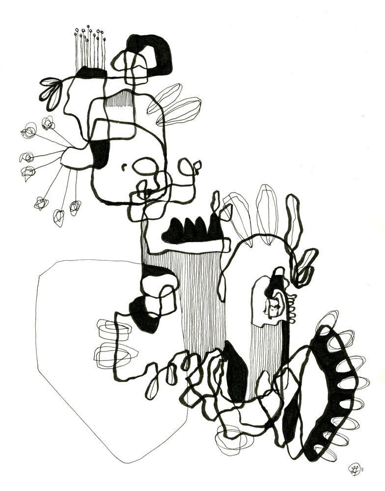
My solo show, which I’ve been calling “Hidden Feelings” has officially been hung at Central Bank of Boone County in Columbia, Missouri USA. If you live around the area, or happen to be passing through, I’d love it if you stopped by to check it out.
For those of you who are not in the area, and for those of you who would like a deeper understanding of the works hanging on the wall, I’ve put together this list of each piece and what inspired its creation.
This is PART TWO of that list. I highly encourage you to check out PART ONE so that you can learn more about the exhibit and its meaning, as well as the first ten pieces you will see as you walk through the show.
My solo show, which I’ve been calling “Hidden Feelings” has officially been hung at Central Bank of Boone County in Columbia, Missouri USA. If you live around the area, or happen to be passing through, I’d love it if you stopped by to check it out.
For those of you who are not in the area, and for those of you who would like a deeper understanding of the works hanging on the wall, I’ve put together this list of each piece and what inspired its creation.
From handmade cards and ornaments, to framed fine art, here is a list of gifts you can buy from my Etsy shop.
Don’t forget, my Etsy sale will be running until this Thursday. Get 20% off almost everything, plus free shipping if you spend over 35$.
Handmade Cards
All of my cards are made with Khadi paper, which has a nice textured “organic” feel. Each one is painted with a unique, intuitive design, which means no two cards are alike. It’s like having a small original painting.
Just like my cards, each of these bookmarks is a tiny original painting. They were painted with high-quality watercolors on a variety of papers, from textured cotton paper to smooth hot press. All of them have also been laminated to ensure they stay safe from tea spills.
I sewed each of these books with a Khadi cover and watercolor paper for the inside. These little books are perfect for travel and hiking, and although the paper is meant for watercolor, it’s resilient enough to endure almost any medium.
Yes, they are made with real clay, the kind you have to put into a kiln. I’m fortunate that the gallery in my area has a ceramics room, which makes it a lot easier for me to make little things like these handmade ornaments. I have a variety of cameras, bunnies, and intuitive shapes to choose from.
Last but not least, I have a large selection of fine art on my Etsy shop. They are reasonably priced, and there is even a listing of ten paintings, each of them only 50$ each! All of my artwork comes with a mat (except for the 50$ an below artwork). Simply choose the frame size and I will have one professionally cut for you.
With things costing much more nowadays, supporting small businesses is even more important, and it would mean the world to me if you would take a peek at my Etsy to find some great gifts.
I’ve been neglecting the last portion of Andy J. Pizza’s version of the “hero’s journey” which is the return. Sure I can make art, wrap it up, take it to art fairs, but the scanning and posting it to my Etsy shop? Fuggedaboutit.
But that’s changed! Art is now being added to my Etsy shop daily and I hope to spend the next few days scanning, posting, and sharing.
All of my original pieces will come with their own custom off-white mat. Most of the listings have three sizes you can choose from so that you can get the right fit for the frame. Other listings have a mat already cut and placed around the painting, and the frame size will be listed.
My original paintings also arrive with a Certificate of Authenticity and, for works on paper, a small guide on how to take care of un-framed art until you have it behind glass.
Hand-Bound Sketchbooks and Zines
I really love making these. The hand-bound books are small and bound with high-quality watercolor paper. Some have been tea-toned and others have not. They also have covers made of Khadi hand-made cotton paper.
The zines are tea-toned and cut/folded and are a more affordable option, especially if you are looking to buy in bulk.
Keep checking in for new arrivals such as tiny art, bookmarks, and prints!
A Gift For My Eccentric Chai Readers:
And, as a special thank you to YOU for reading my blog, I’m offering you 20% off your purchase. Just click here to use the code.
The rain was unexpected. I woke at 7am to my husband returning home from work. We exchanged good mornings/nights and I went downstairs as he went to bed. Him working the overnight shift has been weird for us both, but it’s times like these when I’m glad (instead of guilty) that I have a mostly work-from-home job. Because if I didn’t, who would help Goo get to and from school? Or manage the household during the day while husband is asleep? These are the things I can do for our family, even if the art income wanes.
When I entered the dining room, I looked through the large paned doors that lead to the back deck and noticed how cloudy it was. It wasn’t supposed to be cloudy at all. Hot and sunny, in fact, but instead it looked like it was about to rain. And it did rain. When I poured my coffee I took another look outside and saw the first droplets on the wood of our deck.
With September only a few weeks away I can’t help but already be in “fall mode.” Especially with the fog and the cooling temperatures, and now this morning rainfall. I grabbed a sweater, lit a candle, and decided to make some tea-toned paper for later projects. For some reason, rainy days are the best days for tea-toning paper.
How to tea-tone paper:
Preheat oven to 200 degrees Fahrenheit
Brew a large pot of strong tea. I used about four cups of water with eight tea bags. The stronger the tea, the stronger the stain. This is also true with coffee-toned paper.
Pour the tea into a shallow dish or pan. I used our 9×13 glass baking dish. It’s a good size if I want to stain larger paper.
Immerse paper in tea and leave it in there, turning occasionally, for ten minutes (or more, depending on how stained you want them to be).
Remove paper from tea (letting it drain a bit to get off the excess tea) and then lay it on a baking sheet.
Bake for 5 to 10 minutes, flipping paper every couple of minutes until both sides are dry. Note: handmade paper sometimes takes a bit longer. Just keep turning paper every couple of minutes until it’s dry.
Goo joined me to tea-tone her own paper when the first batch was baking. I showed her how to immerse the paper and remove it carefully to be baked. Regular copy paper will be very fragile and could tear. This can be in your favor, however, if you want your paper to look old. I also showed her how you can crinkle the paper up after it’s been in the tea, before baking, to get a wrinkled effect.
I used some of the hot press sheets for abstract landscapes. For the ink I used the black Hydrus watercolor ink by Dr. Ph. Martin’s. I like this one because it has almost a purple/green granulating effect when you add salt. Combine this with the tan tone of the paper and the landscape resembles a split-toned photograph, something I’ve loved ever since discovering the photography of Irene Suchocki.
I also stained some small, leftover Arches cold press to make a tiny book of landscapes. For no reason other than it’s fun, and because tiny books of landscapes are adorable. I even stained a small sheet of Khadi for the cover.
The clouds held on until that Sunday afternoon, when it warmed up enough to take Goo to the pool. It was an interesting day, like living in two different seasons at the same time. Fall in the morning, summer in the afternoon. This is Missouri when the seasons are changing, and here by the river we get extra fog each morning to remind us that those longed-for chilly, crinkly-leaved, chimney-smoked days are just around the corner.
If you’d like to take a look at the landscapes in this tea-toned project, which I call “Prairie Winds,” you can head on over to my Etsy where they are currently available for purchase. They’re little paintings, meant to be looked at from a closer distance, and minimalist enough to be placed anywhere. I like to imagine them being placed by windows that are occasionally freckled with unexpected rain.
Listen to this blog article and more about the #bunnified project on my podcast, Eccentric Chai.
The very first #bunnified project began in 2021 as a simple tweet: “post your picture in the comments and I will turn you into a bunny.” It was only meant to be a bit of weekend fun. I figured I’d only get about five responses, would spend a day or two drawing these five individuals as bunnies, and would then be on my way to planning the next project. But my Tweeps surprised me. They shared and shared and changed their profile pictures to their haresonas and I gained over 100 followers in about a week. I gave everyone the hashtag #bunnified to use and they added another, #thecottontailcult, and the community came together during these lame times to just laugh and chat and make hare-raising jokes. The project that had started out as a bit of weekend fun had become so much more.
Before I get into all the lessons learned during this project, I just want to say thank you from the bottom of my heart to all of you who participated in the 2021 project, and to those who are participating in this year’s project over on Twitter. This project is so much fun for all of us, and it helped me see that something as simple as a collection of bunny sketches can have a positive impact, despite all the hell we’ve been facing lately.
Now let’s get to the things I learned from bunnifying people over on Twitter.
It’s okay to take breaks. In fact, it’s necessary
Sometimes I wake up and just have no positive mojo. Everything on the news sucks, my faith in humanity is dwindling, and the world just keeps turning despite it all. At one point in 2021 it got to be too much and so I informed my Tweeps that I would be taking a mental health day, and I spent the majority of my time far away from social media and the news, and painted with whatever I could get my hands on.
And you know what? I didn’t lose followers. Nobody told me to get back to work. Nobody complained. In fact, everyone was super supportive and told me to go relax. Because of this, I didn’t hesitate whenever I needed a day off from bunnies. Or anything else for that matter. Some days we just need a binge-netflix-on-the-couch day.
Lesson: Take that break. People will understand, and you will feel a thousand times better once you let the mud settle and the water clear.
Hands are hard, but so are glasses
I mean, we all know hands are tricky. I’ve seen even big-name illustrators draw their character’s hands in their pockets because they don’t have the emotional capacity to deal with fingers at that moment. But what I didn’t realize until this project was that eye-glasses are almost just as hard (for me, anyway). There are so many different shapes, sizes, frames, and these different frames all fit different faces, well, differently. A lot of paper has been tossed into the scrap pile due to hands, but even more so due to glasses.
Lesson: practice those basic shapes!
Find a routine
This reminds me of that Big Bang Theory episode in which Penny decides to sell hair bows and Sheldon teaches her how to create an assembly line that moves to the song of “Hey Ho Blow the Man Down” in order to get more bows done at a time. It took me a little bit to get into a groove during the first week or so of the first project, but trying new techniques and working with more organization allowed me to find the perfect routine so that I could get more bunnies done in the same amount of time. In the beginning of the 2021 project I was doing 3 bunnies off and on over the course of a day. At the end, I was doing 10 bunnies in two hours.
Lesson: Pay attention to your habits and your most productive times of day, then put them together to create a successful routine.
This is the kind of work I want to do
When I was in my young twenties I pursued a degree in psychology because not only did I find humans fascinating, but I also wanted to help them be happier. Once I finished my degree, however, I became a stay-at-home mom and so this was never applied to a career setting. This might explain the many different existential crises when I eventually began to pursue a career in art.
The #bunnification project reminded me that my altruistic motivations haven’t changed. I want to make a positive impact, whether it be by making someone laugh, teaching a fellow artist a new technique, or even painting something that will make someone think “this artist gets me.”
This doesn’t mean my future will be nothing but Haresonas. But knowing my motivations will definitely help keep me on the trajectory that’s most meant for me. No matter what medium I use or what subject I draw or what camera I choose.
Lesson: never forget your why.
There will be more #bunnified projects
Seeing all of the completed bunnies together was super inspiring. I have a few ideas on how to continue the bunnification in the future. One is a yearly “yearbook” which will be a book anyone can purchase with all of the bunnies inside. This itself would be a tremendous project, with a few copyright hurdles I’m sure, but it would be so worth it. Other smaller projects include Halloween Bunnies that I can make for participants to use as profile pics during October, our favorite movie/TV characters #bunnified, and an entire month of pet bunnification.
Whether or not any of the above happens, I’ll still continue to make the Bunnified Project a yearly thing. Every July I will put up the post and then the bunnification will begin. This year’s project has already started over on July and it won’t be stopping anytime soon.So head on over there and add a picture!
Lesson: Art begets art. One project will almost certainly lead to another.
To view the entire 2021 Bunnified Project, Click here.
To view the current finished bunnies of the 2022 project, Click here.
Instead of leaving you with my usual “until next time…” I’m going to leave you with a quote from The Mysterious Stranger, a short story by my spirit animal, Mark Twain:
For your race, in its poverty, has unquestionably one really effective weapon–laughter. Power, money, persuasion, supplication, persecution– these can lift at a colossal humbug–push it a little–weaken it a little, century by century; but only laughter can blow it to rags and atoms at a blast. Against the assault of laughter nothing can stand.
It all starts with a cup of coffee. This morning the coffee has been befriended by a bit of lo-fi. It’s the best way for me to quiet my brain so that I can outline my day/week. Trying to plan with a messy brain is like trying to watch TV with the radio turned up full blast.
Yesterday I was asked to be the Featured Artist at the local gallery. This will be my second time as the Featured Artist (my last time being in 2019) and I’m so excited to get back into the groove of things. I’m to frame and wire 12 or so of my newest paintings this week, drop them all off at the gallery next week, and then I will speak at the reception. The process is daunting, which is why I have to take it one step at a time.
The first step is this cup of coffee, the lo-fi, and these words.
On a busy week like this, keeping my planner up to date is an absolute must. If I want to get everything done in time–and in such a way that I don’t find myself stressed and buried in last minute things–then I need write a checklist and put each task in the right order. It also helps to add deadlines so I don’t wind up waiting to the last minute. Which is exactly what I would do if I didn’t have said deadlines.
After I’ve gotten the week planned out it will be time for me to figure out which of my finished paintings I’d like to show at the exhibition and determine how many new works I will have to paint this week so that I can have a cohesive collection that is up to date.
New paintings means unrolling the giant roll of hot press downstairs, cutting the sizes I need, soaking the sheets in water and hanging them to dry before taping them to boards. Only then do I get to start painting. Larger watercolor paintings can take up to two days. Larger acrylic/mixed media paintings can take up to a week. Since I’m not creating a specific “series” I will want to have some large paintings, some small, and some in-between, so that there’s a variety on the walls.
After the paintings are finished, it’s time to mat and frame them. I could go through and cut all of my own mats, and I might, but it may just be easier for me to have them cut for me. As for the framing, I have dozens of frames, and so I’m hoping I won’t have to make any extra purchases. Then it’s time to re-wire each frame and clean the glass so they all look extra nice for the show.
Intermingled with the exhibition prep is the business side of things. I have to remember to market each day, post on social media, type up a newsletter, maybe add a reel or two to Instagram, keep my website up to date, pack and ship orders, and try not to get behind on the bookkeeping. A lot of people think that this job is all painting all the time, but I spend more time doing the business stuff than the painting stuff. It can get pretty dry, so I try to find a way to be creative in each of these things so that I don’t get bored or put it off. Ordering my business cards, for instance, is more fun when I create my own design. Putting together a flat-lay image for Instagram is more fun when I search for things around the house to add that will accent the painting, such as flower petals or interesting rocks. Bookkeeping is way better when I have music I can sing to.
Finally, there are the out of the house tasks. Luckily I have no classes this week, as that would only add to the workload, which means I only have this evening’s After School Art Club to plan around. I had thought about rescheduling tonight, but watching the kiddos do art and getting so focused the room gets quiet is always so rewarding. Plus I get out of the house and that’s often a task all on its own.
Oh and did I mention today is my 14th wedding anniversary?
Busy weeks are exhausting, and I won’t lie and say I don’t get stressed out. This, like every other career out there, is still a job. Sure, there are days when I feel like Picasso and am banging out paintings left and right. But then there are days when I just want to lie around and watch Judge Judy. Those are the days when that very first step is the most important. That first cup of coffee and the lo-fi.
And I can always watch Judge Judy while updating my shop.
Until next time, may your coffee stay hot and your lo-fi stay smooth.
Those of you who follow my Instagram and Twitter know that I took a break over the weekend from the “business” side of things and instead traveled to St. Louis to visit the Van Gogh immersion exhibit. While there, we also visited the Gateway Arch and perused its underground museum. Getting out of the house and doing something brand new seemed to be just what I needed to get back into my creative flow. Before we even left for the two hour car ride, I was already scratching out landscapes with pastel pencils.
I continued these little landscapes off and on through the car ride to keep myself busy and also while waiting for our dinner. Goo even joined me in the sketching after we purchased her a sketchbook from the Van Gogh exhibit.
And speaking of the Van Gogh exhibit, could there be a cooler thing to experience? The whole first part of the exhibit was quotes from his letters to Theo and tidbits of history. The second part was a 35 minute long immersion experience, during which you could walk around or sit as Van Gogh’s work is projected all around you. Sometimes the paintings would move, portraits would blink, and his sunflowers would grow from behind paintings of wheat fields.
Goo loved the Japanese flowers and Starry Night, and my husband marveled at the night paintings, which had been animated slightly to show the water moving. I myself was in love with all of the self-portraits and admired each one. When we returned home that evening, Goo told us it was one of the best days of her life.
Since our St. Louis experience I’ve been binge-watching both Van Gogh and Monet documentaries. They are two of my creative heroes, and a lot of their philosophies about art, and life, make sense to me. During one of the Van Gogh documentaries, the narrator, who was being a voice for Van Gogh, said that after picking up oil painting: “I painted as I drew.” And something about that line clicked a gear into place.
I had been working with charcoals and pastels all weekend, scribbling and creating my little rocky landscapes, but what if I applied those same methods to watercolors? I decided to give it a go.
These are little paintings, around 5×7 inches, but I love the results so much I’ve already stretched out a large piece of hot press (approx 18×24) for a larger landscape “waterscribble.”
The methods are very similar, though with the waterscribbles I don’t actually “scribble” as that would ruin my brushes. But I do trail the color downward to create those same organic lines resembling roots. With watercolor I also don’t have the luxury of painting over dark colors with light colors as I would with dry media, but I do have the option to use ink or even gouache should I decide I want some lighter colors on top.
For these two pieces I used two separate palette boxes by Prima Watercolor Confections. The orange/red one was the Woodlands palette and the blues one is the Currents palette. For the blue one I also added a bit of copper-colored ink to give it an extra shimmer.
This past weekend has re-affirmed to me that taking a break can be so helpful in moving my career and/or my art forward. I’m hoping that this new boost in creative mojo will give me the energy I need to finally finish some larger work.
Until next time, may your creativity flow and your fun be immersive.
Every year I hope to get a nice, consistent body of work when putting together my top nine. But I’m beginning to learn by now that it’s a lost cause. After four years of attempting this, my end-of-the-year grid is still a menagerie of experiments. But that’s okay because I, myself, am a menagerie. And an experiment.
Instead of using the grid I could generate through a few apps, I decided to put together my own top nine. I wanted to see what my favorite works/projects were from the year, hoping it would provide a compass for next year’s shenanigans. It took some work, but I finally put together my nine favorites from the year. To make them less hodgy-podgy, I used a framing app to give them all their own showcase:
Some of these pieces are merely a symbol of a project, while the others are stand-alone works. Still, I figured it would be fun to share a little tidbit from each to help you get to know each of them and why they were chosen for my final grid of the year.
“Winter Sunset” is the newest piece from this bunch. I created it at the end of a long–and fun–day of experimenting. I had splashed out a few composition ideas on some sketch paper and once I’d chosen the best one I grabbed a 9×12 sheet of Arches cold press. I wanted to get some serious granulation so I used transparent red oxide and a turquoise shade from one of my Watercolor Confections palette boxes. For some reason mixing those two colors creates an explosion of granulation, as you can see at the top of the paper.
And speaking of the top of the paper, that actually used to be the bottom. Once the painting had dried, I decided to flip it to see it in all four directions and I liked the painting better upside down than its original right side up. I felt the composition was stronger this way.
“The Blue Dress” represents a series of mixed media pieces I had scribbled out during a particularly scribbly phase in the summertime. I had recently finished my basement studio and had taped up 10+ mixed media sheets of paper on the large empty wall so that I could just experiment with whatever medium I grabbed. Most of what was grabbed was oil pastels and pencils, which made the scribbling even more fun. As a lot of you know, intuitive art is one of my favorite ways to create, because I never know what I’m going to come up with, and because afterward I can often see something that was hidden deep within my subconscious. This particular piece is connected deeply to my childhood, as were a lot of the pieces on this wall.
“Dance of the Baleine” was another intuitive piece that I created after watching the documentary, Seaspiracy. It was a heartbreaking thing to watch, and so I followed it up with a few more cheerful sea-friendly documentaries, such as My Octopus Teacher. Despite the sadness in my heart, this piece became more of a celebration of sea life, and to this day it’s one of my favorite intuitive pieces because of it’s sea-bubbly shapes and expressive lines.
Because of what had inspired the piece, I wanted to donate my earnings from this painting to an ocean foundation, but to this day it hasn’t sold. Still, I hope to put it back up on my shop next week and give it another go. I feel this piece deserves more than to sit in a dark portfolio for its lifetime.
“Nature Photography” is from a small group of digital pieces that I’d created for my poster project. The idea behind it was that film is not dead, and was something of a gift for my #believeinfilm friends on Twitter. They are so much fun and are like a second family! Not only does this piece represent that community, but it also combines two of my loves: photography and nature. This one was my favorite of the bunch because of its colors, and because of the Canonet-like appearance of the camera.
This untitled piece was part of another #bunnified project on Twitter, during which I bunnified several cameras for my #believeinfilm tweeps. Someone had uploaded an adorable cat among the sea of cameras and I couldn’t resist bunnifying the kitty. Because of its expressiveness, the naïve-like and sketchy style, and the colors, it almost immediately became my favorite piece of the year. It was definitely a breakthrough piece, for sure, but what really solidifies my love of it is that it almost symbolizes this year for us, as our biggest life change this year was taking in a very sick stray cat, who we named Coco. Despite the odds being mostly against him, he’s now a rambunctious and psycho young cat who runs around the house with fuzzy toys in his mouth and meows incessantly to be pet at all hours.
To view the bunnified camera thread, you can click here.
“Levitate” was part of a photography project called “These Woods are Haunted.” I explored a variety of different methods with this collection, from using a very slow ISO 8 film, to long exposures and trick photography. All of these works were shot on film, making it even more of a challenge (the fun kind). The idea was to create eerie photography that started with thumbnails and ended with a finished piece. One of the pieces from this collection, “Sisters,” actually won first place in photography at a local exhibition.
This particular shot was created with my Rolleiflex on Portra film. The idea behind it was to use trick photography to create an illusion of Goo floating. This technique is actually really simple, and only required two shots to make the final image. After setting the camera up on a tripod, I took one shot of my husband holding our daughter up, and a second shot with nobody in the frame. Then it was just a quick masking in Photoshop to remove my husband and voila.
“The Roots Grow Wider” is a digital piece inspired by a small collection of paintings I’d done in 2020, in which the roots of the tree would be the main subject instead of the tree itself. The idea was not only inspired by the Yin-Yang philosophy, but also the concept that tree roots are often wider than the tree branches themselves. This same concept is true for us humans, as we are more than we appear. The roots of our personality have traveled through dark places, small crevices, hard stone, to make us who we are. We are also much more than we appear, our external selves showing much less than what is within us. Who we are at work, for instance, pales in comparison to the vast flora of our true selves.
This Bunnified version of Goo represents the entire #bunnified project that I started in July on Twitter. What was meant to be a bit of weekend fun wound up being a months-long project during which I bunnified anyone who posted their picture to the thread. I had so much fun and I loved seeing everyone’s reaction to their bunnies. Many profile pictures turned to bunnies during that time–and many still are bunnies to this day–and my tweeps even coined the hashtags #bunnified and #cottontailcult. The local newspaper even did a story on the project! Because of the fun it provided to not just me, but to those who participated and/or enjoyed, I hope to embark on an even larger series of projects in the coming year, including a #bunnified365 in which I will bunnify something each day. Just for fun.
To read more about this project and to see all 140 bunnies, click here.
“Wind in the Prairie” is a collection of freelensed photos I took during a recent walk at the local conservation center. It had been so long since I’d taken my deconstructed 50mm lens out to freelens and we were not only close to the golden hour, but the wind was just delicious. Windy days are MY FAVORITE and I made it my goal to take pictures of the wind. Getting the dreamy images in this little series reminded me of how much I not only love this lens, but freelensing in general. I have made it a goal to do more and celebrate this side of me.
And there you have it, those were my personal top nine of 2021! I wonder what next year will bring, if it will be more photography than paintings, or more abstracts than representational. What I do know is I no longer want to hold myself to pesky labels, and I want to do more fun things that get the community laughing and sharing, even when things on the planet are just ridiculous. I also want to do quieter things, like freelensing the wind and maybe going on walks without any art tools whatsoever. What about you?
Until next time, may your supplies be endless and your lenses be free.
I first decided to pick up a watercolor brush some time after Goo was born. I had always loved painting with acrylics, but had never tried watercolors, and one day, for whatever reason, I decided it was time and I went to the art store and bought the cheapest materials I could find.
Yannow, just in case I didn’t like it, I didn’t want to spend a fortune.
But that was my first–and my most fatal–mistake. My watercolor intrigue was ravenous (and once I started painting I knew I would love it forever), but because I was using junk material I became frustrated very quickly and prematurely decided I wasn’t going to be any better than the average wannabe. It wasn’t until I picked up the watercolor brush again some time in 2017, and allowed myself to invest in better materials, that I learned it hadn’t been me all along. I myself wasn’t crap. The materials were crap.
Since then I’ve made it my goal to tell everyone who wants to give watercolor a try, (and those who have given it a try but gave up), that materials are, in my opinion, THE MOST IMPORTANT FIRST STEP of the watercolor journey. Whether it be for a budding beginner or meticulous master.
However, it would do no good to say to you to “go out and buy the best.” Because for one, the best is going to be different for everyone, and because there is more than one great paper/brush/watercolor. It’s enough to give anyone choice overload, and a beginner might just decide to quit before she even tries.
I recently put together a four part watercolor course that I have been giving at the local gallery called Watercolor Explorations. The class isn’t just about learning the basics of watercolor, from washes to adding salt, but it’s also about exploring the many different ways we get to play with watercolor and all of the materials this awesome medium has to offer. And because the most important part is the materials, the entire first class was all about the different kinds of materials/brushes/substrates/watercolors you can choose from. And students were able to play with each of these things and decide what felt right for them.
While I can’t exactly giveyou a bunch of samples through this blog post, I can, however, give you a list of all the different materials I brought to this first class and share with you what is special about each of them. This might help you decide on which materials you would like to start out with, should you be thinking about embarking on a watercolor journey of your own. Keep in mind that as you progress on this adventure, you will acquire more things to play with, so in the beginning it’s best to just go with your gut. Choose one pad of paper or a sketchbook, a couple of brushes, and a primary set of watercolors that you think will give you your best start.
Note: I get no kickback for recommending these brands. These are simply what I have found to be my go-to brands and are what I use in my beginner’s classes.
This paper pad has a rough, almost sandpapery surface that is perfect for soaking up watercolors while also giving you a beautiful texture. If you plan on using a lot of watercolor, or if you are at your very infancy of watercolor, I would suggest this paper. Cold press is the more popular type of watercolor paper and is great for both practicing and for painting anything from portraits to landscapes.
I have heard a lot of people using Arches hot press paper, but I myself have tried it and don’t like it. It feels more like mixed media paper (like cardstock) to me than watercolor paper. The Canson brand, however, is super soft and delicate. It feels like cotton, because it is cotton, and it even provides a pretty texture if you look close enough. This substrate is great for illustrators or for those who want to draw with ink pens as well as use watercolors, as it doesn’t have that toothy surface cold press is known for. Instead it’s smooth and soft. I myself have also found that colors “pop” better on hot press. Though I could be biased.
Handmade recycled cotton paper 140lb:
There are a few different brands of the handmade recycled cotton paper and I have found them all to be pretty decent. Khadi is my most favorite, but it’s been tricky getting it with Covid, as it is hand-made in India. Shizen is another good brand, but the paper is much much thicker and bumpier than Khadi and may not be the greatest thing for a beginner to start with.
Out of all of the sketchbooks I’ve tried, this is my most favorite. It’s not too expensive and because it’s mixed media you can use a variety of tools to just “play.” The paper is similar to hot press and the soft cover makes it much easier to lay it flat. For me, this is the only sketchbook I buy for my practice and experiments.
Brushes
A brief note about brushes: since there are soooo many different types of brushes out there, I will simply state here that you could do well with one or two sizes of round brush, a flat brush, and something tiny for details. The Princeton brand listed below has a great starter set that got me through a lot of my early play.
Water brushes are brushes that you can load with water so that you always have water on-hand. These brushes are great for sketching/plein air as you can just pack them instead of a jar or two for water. These are also great for those of us who have cats that love to knock over anything cylindrical with liquid inside.
Paints
Tube paint:
When most of us think of watercolors, we think of the cakes, those little circles of color we used when we were in kindergarten. But actually watercolor comes in a variety of different forms and one of these is in a tube. You can use the tube either by pouring it into empty pans (which you can purchase) or just putting a pea-sized amount on a palette when you’re ready to paint. The neat thing about either of these methods is that even if the watercolor dries, you can just wet it down again and voila it becomes watercolor again. You’ll hear a lot of different names when it comes to tube paints, but one of the most popular–and for good reason–is the Daniel Smith watercolors. They are bold and delicious, and there are dozens of colors to choose from. You can tell from their descriptions of each color that they really know what they’re doing. If you’re not sure what color(s) you’d like to start out with, I would suggest getting the simple primary set and maybe a brown like burnt umber. These four tubes would be all you’d need to get started, as they can create a variety of colors on all ends of the spectrum.
Liquid Watercolor Ink:
Another type of watercolor not a lot of budding watercolorists know about is watercolor ink. This is a super concentrated form of watercolor and comes in a little bottle with an eye-dropper. You can water it down to form a nice transparent color, or you can use it right out of the tube for super bold and bright results. The great thing about watercolor ink is that, unlike alcohol ink, you only need water to work with it. Dr. Ph. Martin’s Hydrus watercolor inks are awesome.
Paint Sets:
Finally, we will discuss the cakes or pan sets that we all know about. There are a lot of these as well, and those fun no-named sets at the local hobby shop that have a thousand colors might look super enticing, but they’re a lie. A lot of the times they wind up drying chalky and/or desaturated. I have tried many different cake sets and there are only two I recommend to beginners.
The first one is the Winsor and Newton set. This is a great set for any watercolorist at any stage. You get a bunch of different colors in the set, and even a little water brush that fits right in the box. Best of all the lid becomes a palette and so if you were to take this out into the wilderness, for instance, for some plein air, you would only need this kit and your paper.
The second set I recommend is actually a whole series of sets. These are the Watercolor Confections by Art Philosophy. What’s fun about these is that each of the boxes has its own theme. The Woodlands palette, for instance, is full of earthy tones that are great for landscapes, and the Currents palette is chock full of blues and greens for paintings with bodies of water from tiny streams to the big blue sea. Goo’s favorite palettes are the Tropicals palette, which has a ton of pinks and purples and yellows, and the Shimmering Lights palette which is full of irridescent, glittery hues. Click here to see all of their sets.
Final Thoughts:
Those of you who are totally new to the watercolor world might look at this list and balk, but don’t worry. Most of us started with the bare minimum of supplies and worked our way toward a larger collection. After a while you will notice you only stick with one or two brushes, a specific type of paper, and a handful of hues. So do your best to explore, play and, as Adriene Mishler says in yoga class, “find what feels good.”
If you have any questions regarding these watercolor tools–or if you have any questions about watercolor in general–you can email me at lina@linaforrester.com and I will be able to either answer your question or point you in the direction of another artist who can.
Until next time, may your watercolors be flowy and your paper never warp.